Why we say no to the dashboard
People don't open Mediora to look at charts. They open it to fix things. Here's how that one belief changes every product decision we make.
Nº 3
4 min read
Trust the data, not the signal bars.
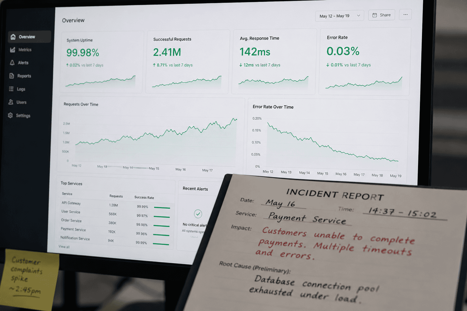
Every SaaS product eventually builds a dashboard. It is practically a rite of passage. The sales team asks for it. The customers ask for it. Someone in a demo asks "but where do I see the overview?" and the product team adds a ticket and the ticket becomes a sprint and the sprint becomes a feature and the feature becomes the first thing on the marketing site.
We have a dashboard. This is not an article about not having one.
It is an article about the seventeen dashboard features we said no to, why we said no, and what we built instead — because the answer to "where do I see the overview" turned out to be more interesting than a bar chart.
The assumption buried in the question
When someone asks for a dashboard, they are usually asking for one of two different things, and the difference matters enormously.
The first kind is a decision-support tool. It surfaces trends, anomalies, patterns across time. It answers questions like: are we on track, are things getting better, where should I focus next month. This is genuinely useful. It belongs in a management layer. It requires good data, careful design, and users who have time to sit with it.
The second kind is a status board. It answers: what is happening right now, what needs my attention today, what is broken. This is what most people actually mean when they ask for a dashboard. They are not asking for charts. They are asking for a triage list.
For most of Mediora's users — field technicians, service coordinators, operations managers at equipment companies — the thing they need is the second kind. And the second kind is not a dashboard. It is a queue.
We spent about eight months building dashboard features before we understood this distinction clearly enough to act on it.
What we noticed about how people actually used it
In early 2024 we ran a session analysis across a sample of active accounts. We were looking at session start behaviour — the first action a user takes when they open the app or the web platform.
The numbers were not subtle. Across all user roles, more than 80% of sessions began with navigating directly to a device record, a job, or a search. Fewer than 6% began on the dashboard. Of those, the average time spent before navigating away was eleven seconds.
Eleven seconds is not analysis. Eleven seconds is a glance to confirm that nothing is on fire, followed by getting to work.
We interviewed a sample of service coordinators — the role that, by job description, should be most interested in operational overview. One of them put it plainly: "I check the dashboard the same way I check the weather app. I'm not studying it. I'm looking for a reason to worry. If I don't see one in five seconds, I close it."
That sentence rewrote our product roadmap.
The feature we almost shipped
Around the same time, we had a nearly-complete build of an analytics module. Customisable widget grid, configurable date ranges, exportable charts, the works. It had taken two engineers six weeks. It looked good in demos. The sales team loved showing it.
We shelved it.
Not because dashboards are bad. Because this dashboard was solving for the demo, not for the work. The charts were impressive at a distance. Up close, in the actual rhythm of a service team's day, they were adding noise to a workflow that needed less of it.
We asked ourselves: if we shipped this, would a technician in the field use it? Would a coordinator use it during a busy Monday morning when three jobs have come in simultaneously and one hospital is calling?
The answer was no. So we didn't ship it.
What we built instead was a prioritised work queue — jobs ordered by urgency, with equipment context, customer history, and parts availability surfaced inline, without the user having to navigate anywhere. The same information the dashboard was trying to show, restructured around action rather than observation.
The product principle we extracted from this
We have a principle internally that sounds simple and is surprisingly hard to apply in practice: design for the moment of use, not the moment of review.
Dashboard design is almost always designed for review — for the manager stepping back, looking across the week, making a considered judgement. This is a real need. It just isn't the dominant need in operational software used by people who are physically moving between locations, handling equipment, and making decisions in real time.
The moment of use for a field technician is: I have arrived at a site, I have a device in front of me, I need to know its history, its open issues, and what parts are on hand before I touch anything. The moment of use for a service coordinator is: I have three incoming requests, I need to assign them to available technicians and communicate ETAs to the hospitals. Neither of these people needs a chart. They need the next thing.
This principle has killed more features in our roadmap than any other. Every time we add something, we ask: is this for the moment of use, or is this for the moment of review? If it's for review, it goes in the reporting layer — deliberate, scheduled, not in the critical path. If it's for use, it gets the best real estate we have.
What we actually built instead
The queue model extended further than we expected. It became the structural spine of the entire product.
Each role in Mediora has a queue that is its own — not a filtered view of a shared table, but a genuinely different prioritisation logic. A technician's queue orders by proximity, urgency, and equipment familiarity. A service manager's queue surfaces exceptions: jobs overdue, contracts expiring, devices with repeated issues. A coordinator's queue is about communication state: what's been acknowledged, what's waiting, what's at risk of missing an SLA.
The same underlying data. Three different answers to "what should I do next."
We also built what we call inline context — rather than making users navigate to a dashboard to understand the state of something, we bring the relevant state to wherever the user already is. When a technician opens a device record, they see not just that device's history but its position in the service load for the week, parts availability, and whether any related devices at the same hospital have open issues. They didn't ask for this. They don't have to know it exists. It's just there, because they need it.
The part where we kept some charts
To be clear about the thing we are not arguing: data visibility matters. The managers and directors who use Mediora do want to see trends. Audit prep requires exportable records. Board meetings require numbers.
The dashboard we did build — the management layer — exists for this. It is deliberately separate from the operational layer. You access it from a different nav item. It has date range selectors and exportable tables and the kind of charts that belong in a Monday morning review meeting.
We built it last, after the operational layer was solid. We built it for the people who need it, not for the demo. And we have resisted, consistently, the pressure to promote it to the home screen — to make it the thing users see first — because for most users, most of the time, it would just be in the way.
Why this is hard to maintain
Saying no to dashboard features is easy to do once. It is hard to do as a policy, because the requests don't stop.
Every new enterprise prospect has a data team that wants custom reporting. Every expansion conversation includes a request for more widgets. The instinct to add is strong, and it is not irrational — customers are asking for this, and customers are usually right about what they want.
The discipline is in remembering the distinction. More data visibility in the management layer: yes, always. More charts in the operational layer: no, because the person doing the work is not there to study charts. They are there to fix something.
We keep the eleven seconds in mind. The coordinator who checks the dashboard the same way she checks the weather. If she doesn't see a reason to worry in five seconds, she closes it and gets on with her day.
That is, actually, the best possible outcome for a dashboard. It just doesn't make for a compelling demo.
Share

about the author
Jakub Horak
Head of Design
Writes about product thinking, calm software, and what editorial design has to teach a SaaS team.
Continue reading
More from the same beat — operations, equipment, and the slow business of building reliable software.